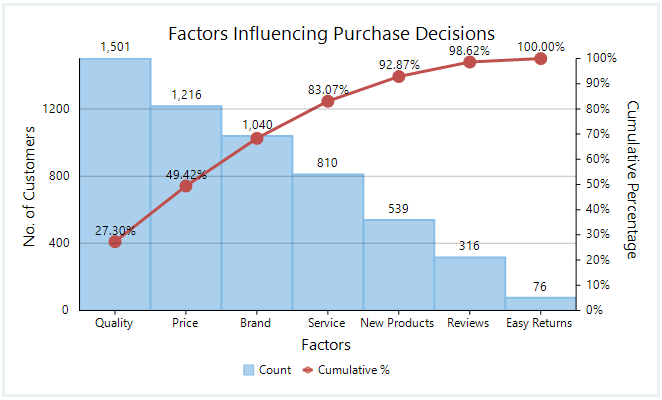
A relative frequency pareto chart consists of two graphs – a bar graph showing frequencies and a line graph showing cumulative frequencies (in percentages) over it.
We now explain how to construct a relative frequency pareto chart by means of an example.
Steps to construct a Pareto chart:
- Given the frequency table, calculate the cumulative frequencies by adding the current and previous frequencies.
- Convert the cumulative frequencies to percentage, by first dividing with the total frequency and then multiplying by 100.
- Plot the frequencies using a bar graph.
- Plot the cumulative percentages and join them by straight lines.
Example:
Suppose we are given the following data on factors influencing purchase decisions vs the number of customers.
| Factors Influencing Purchase Decisions | Number of Customers |
| Quality | 1501 |
| Price | 1216 |
| Brand | 1040 |
| Service | 810 |
| New Products | 539 |
| Reviews | 316 |
| Easy Returns | 76 |
Step 1: We first find the cumulative frequencies by adding up the current and previous frequencies.
| Factors | Frequency | Cumulative Frequency |
| Quality | 1501 | 1501 |
| Price | 1216 | 1501+1216 = 2717 |
| Brand | 1040 | 1501+1216 + 1040 = 3757 |
| Service | 810 | 4567 |
| New Products | 539 | 5106 |
| Reviews | 316 | 5422 |
| Easy Returns | 76 | 5498 |
| TOTAL = 5498 |
Step 2: We convert the cumulative percentage by dividing cumulative frequency by total frequency and multiplying by 100.
| Factors | Frequency | Cumulative Percentages |
| Quality | 1501 | (1501/5498)*100 = 27.30% |
| Price | 1216 | (2717/5498)*100 = 49.42% |
| Brand | 1040 | (3757/5498)*100 = 68.33% |
| Service | 810 | (4567/5498)*100 = 83.07% |
| New Products | 539 | (5106/5498)*100 = 92.87% |
| Reviews | 316 | (5422/5498)*100 = 98.62% |
| Easy Returns | 76 | (5498/5498)*100 = 100% |
| TOTAL = 5498 |
Step 3: We plot the frequencies using a bar graph and plot the cumulative percentages using a line graph. We obtain the relative frequency pareto chart as shown below.