In a vertical bar graph, we plot the various frequencies for different classes in the form of vertical bars. We also do this in a pareto chart, but in addition, we plot the cumulative frequencies (expressed in percentage) above the bars and join them by straight lines.
The below image shows an example of a pareto chart.
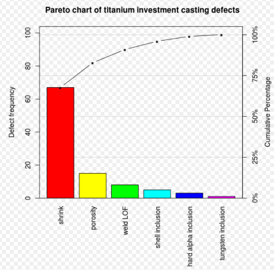
As we can see in the above image, the cumulative percentages have been plotted above the bar graphs and have been joined by straight lines. Therefore, a pareto chart has a line graph above the bar graph.
Moreover, in a pareto chart the categories/bars always represent some kind of factors for the occurrence of an event. As we can see in the above image, the bars represent the different causes for casting defects.
To summarize, a pareto chart is different from a standard vertical bar graph in the following two ways:
- The pareto chart includes a line graph showing cumulative frequencies (expressed in percentage) above the vertical bar graph.
- In a pareto chart the categories/bars always represent some kind of factors/causes for an event.