In this article, we explain how to make a histogram on the TI-84 calculator.
A histogram allows us to visualize data given in the form of raw data values. We plot the values on the X-axis and the frequencies on the Y-axis.
Consider the following set of data values:
12, 13, 15, 17, 19, 20, 11, 16, 18
Step 1: Enter the Data Values
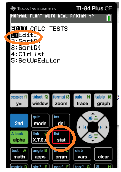
Press the “STAT” button and then choose “EDIT”.
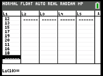
Enter the data values in the first column.
Step 2: Plot the Data Values and generate bars.
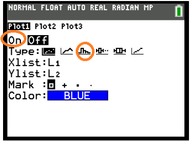
Press “2nd” and then press the “Y=” (stat plot) button. Click “Enter” on Option 1.
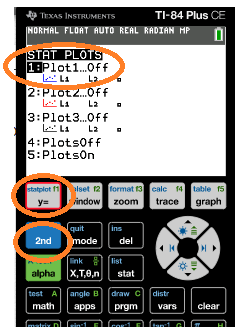
Choose “ON” and then choose the histogram icon (circled below). Then press “Enter”.
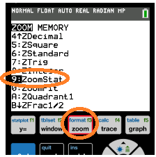
Now, press the “ZOOM” button and select ZOOMSTAT.
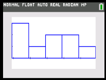
On pressing “Enter”, we obtain the frequency bars.
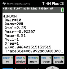
Step 3: Adjust the X-axis Values and the Scale of the Graph.
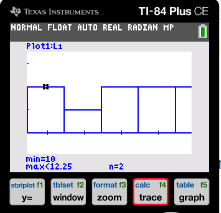
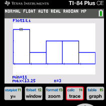
We can use the “TRACE” button to check the limits of each bar of the histogram.
Click on the “Window” button. You can change the minimum and maximum values on the X axis as well as the scale on both the X and Y axis. For example, we set the minimum X value to be 10 and the maximum X value to 20 below.
Click on the button “Graph” to plot the new histogram.