Bar charts are one of the most fundamental types of charts, also making them the most widely used. So, it is imperative to understand when one should use bar graphs & what type of bar graph should be used when.
The first question to think about when choosing a type of graph is whether it is suitable to represent the kind of data you are dealing with. So, what kind of data are bar graphs best suited to represent?
Bar charts are best suited to represent categorical and discrete variables.
Put simply, categorical variables refer to types of qualitative data that can be divided into groups. Examples of categorical variables include race, gender, age group etc.
Discrete variables are ones that take either finite or countably values. Examples of discrete variables include the population of a country, numbers of books in the library and more.
Other than the types of variables bar graphs are best suited to display, it is important to understand that one of the primary functions of bar graphs is that they help determine the individual standing of categories & differences between categories, so they should be used if one intends to highlight individual categories and differences between them.
Another important thing to note is that when one uses bar graphs, there should be a limited number of categories to compare.
Now that we know when we should use bar graph, let’s look at the different types of bar graphs and understand when you should use them:
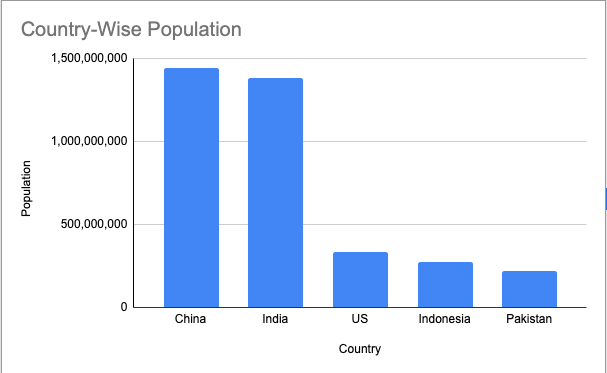
Vertical bar charts and when to use them
Vertical bar charts, as the name suggests, display data bars in a vertical fashion. Vertical bar charts are best suited when you want to compare 5 or less than 5 categories.
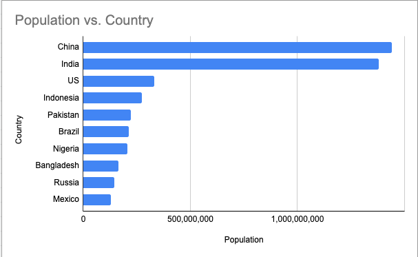
Horizontal bar charts and when to use them
Horizontal bar charts are useful when you have more than 5 categories because looking at graphs with more than 5 categories in a horizontal fashion is easier on the eyes compared to vertical graphs with more than 5 categories.
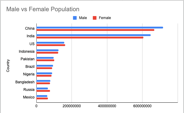
Grouped bar charts and when to use them
Grouped bar charts are most useful when there are two or more items for each category, and one needs to compare those items across categories.
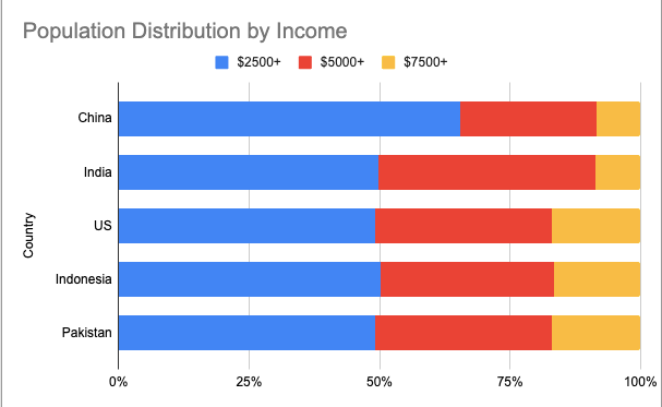
Stacked bar charts and when to use them
Stacked bar charts are useful for displaying part to whole relationships among categories. In cases where Grouped bar charts might not necessarily be able to present the differences between the total of each items of a category, stacked bar charts can come in handy.