A frequency polygon is a graphical way to visualize data given in the form of a frequency distribution table. It is similar to a histogram which is also used to visualize grouped data. We can use the frequency polygon to easily compare two or more sets of data.
How to construct a frequency polygon?
Let us now understand how to construct a frequency polygon by means of an example. Consider the following data given in the form of a grouped frequency distribution table.
| Class Intervals | Frequency |
| 0-10 | 4 |
| 10-20 | 6 |
| 20-30 | 7 |
| 30-40 | 9 |
| 40-50 | 14 |
| 50-60 | 16 |
| 60-70 | 12 |
| 70-80 | 9 |
| 80-90 | 4 |
| 90-100 | 2 |
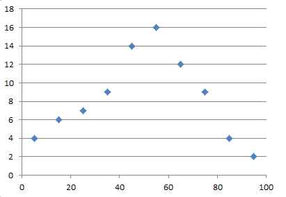
Step 1: Find the class marks for the given class intervals by using the formula,
Class Mark = (Lower Class Interval + Upper Class Interval)/2
| Class Intervals | Class Mark | Frequency |
| 0-10 | (0+10)/2 = 5 | 4 |
| 10-20 | (10+20)/2 = 15 | 6 |
| 20-30 | (20+30)/2 = 25 | 7 |
| 30-40 | (30+40)/2 = 35 | 9 |
| 40-50 | (40+50)/2 = 45 | 14 |
| 50-60 | (50+60)/2 = 55 | 16 |
| 60-70 | (60+70)/2 = 65 | 12 |
| 70-80 | (70+80)/2 = 75 | 9 |
| 80-90 | (80+90)/2 = 85 | 4 |
| 90-100 | (90+100)/2 = 95 | 2 |
Step 2: Plot the values of the class mark on the X-axis and the values of the frequency on the Y-axis.
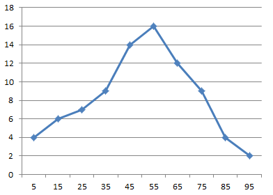
Step 3: Join the points using line segments to obtain the desired frequency polygon.
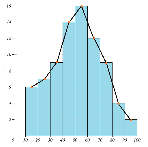
ALTERNATIVE METHOD:
We can also obtain the frequency polygon by first drawing a histogram and then joining the mid-points of the upper horizontal side of each rectangle with the adjacent one.
Frequency Polygon vs Histogram:
The main advantage of a frequency polygon over a histogram is that we can plot two or more frequency distributions on the same graph which helps us to compare the frequency distributions.
Also, the frequency polygon is much easier to sketch compared to a histogram and the polygon becomes increasingly smooth and curve-like as we increase the number of classes.
When constructing frequency polygons we face the same difficulties as histograms – they cannot be used for distributions having open-ended classes and the data requires adjustment when there are unequal class intervals.
What is the difference between a frequency polygon and an ogive?
The main difference between a frequency polygon and an ogive is that we plot the frequencies on the Y axis in a frequency polygon whereas, we plot the cumulative frequencies on the Y axis when drawing an ogive.