In order to understand the relationship between two variables it is a common practice to plot the values of the variables on a graph. This allows us to easily understand the relationship between the two variables.
The two variables whose relationship we want to study are known as the dependent and independent variables. A change in the value of the independent variables causes a change in the value of the dependent variable.
Axis Corresponding to Each Variable:
The X-axis shows the value of the independent variable whereas the Y-axis shows the value of the dependent variable. We can understand the relationship between the two variables by looking at the graph obtained by plotting the values of the variables.
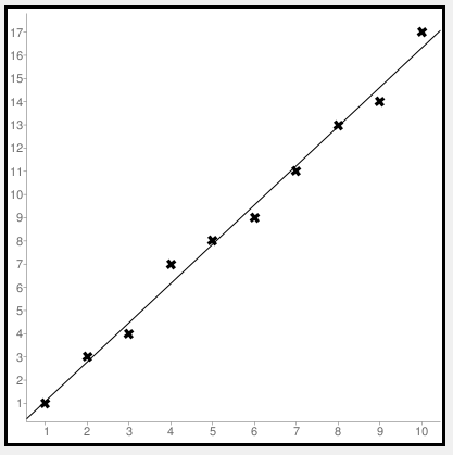
When the variables are positively correlated then we obtain a graph whose height is increasing as shown below. By positive correlation, we mean that an increase in the value of the independent variable leads to an increase in the variable of the dependent variable. For example, consider the two variables – Age and Shoe Size. As the age of a person increases so does the shoe size. Here the independent variable is Age and the Dependent variable is Shoe Size.
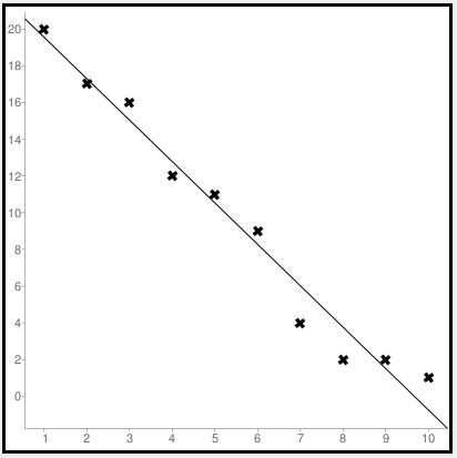
On the other hand, if the variables are negatively correlated then we obtain a graph whose height is decreasing from left to right as shown below. By negative correlation, we mean that an increase in the value of the independent variable leads to a decrease in the value of the dependent variable. For example, consider the two variables – Number of days absent in Class and Grades Obtained. If a student is absent from class most of the time then there is a corresponding decrease in the grades achieved.
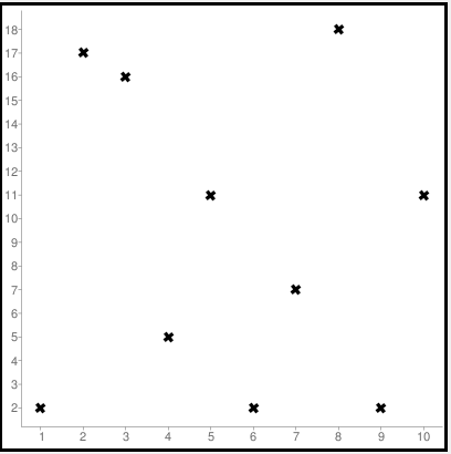
When there is absolutely no relationship between the two variables then the scatterplot consists of points appearing in a random manner without an increasing or decreasing pattern. We obtain a scatter diagram as shown below.