By raw data in statistics, we mean the unprocessed data that has not been organized in any logical manner. For example, when collecting the heights of students in a class the raw data will simply consist of the numbers giving the heights of the individual students in the class.
Why do we process Raw Data?
The main drawback of raw data is that since this kind of data simply consists of a list of numbers it is hard to draw any conclusions about the set of data. This is precisely why it is so important to process this kind of raw data in order to make sure that the data is easy to understand.
We can process the raw data by dividing the data into intervals and representing it in tabular form. This makes the data much easier to grasp and understand. Another advantage of expressing the data in tabular form is that it now becomes easy to visualize the data by means of histograms, bar charts, etc. Let us try to understand how we can process the raw data by looking at some examples.
Example 1: Converting Raw Data to Tabular Form
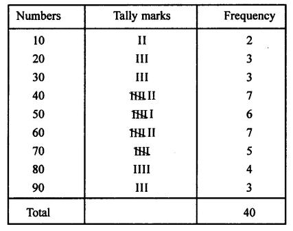
The marks obtained by 40 students of a class are given below :
80, 10, 30, 70, 60, 50, 50, 40, 40, 20, 40, 90, 50, 30, 70, 10, 60, 50, 20, 70, 70, 30, 80, 40,20, 80, 90, 50, 80, 60, 70, 40, 50, 60, 90, 60, 40, 40, 60 and 60
As we can see above we are simply the data as a sequence of numbers. This means that the data is in a raw form. We can now try to convert the data in tabular form. For example, since 2 students have got 10 marks we note down the frequency beside 10 to be 2 in the below table. The data expressed in tabular form is shown below:
Example 2: Expressing the Raw Data Visually
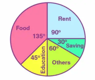
Suppose we are given the following information: A person’s monthly income is 7,200 dollars. He spends 1800 dollars on rent, 2700 dollars on food, 900 dollars on the education of his children, and 1200 dollars on other things and saves the rest.
Once again the given information simply consists of a set of numbers. This means that the data is in raw form. The data becomes much easier to understand when expressed in the form of a pie chart as shown below: