By range, we mean the deviation, that is, the difference between the two extreme values, that is, the maximum and minimum values of the variable under consideration.
A range graph, also sometimes known as a zone graph, is used to depict and emphasize the range of variation of a phenomenon for each period. For instance, for highlighting the range of variation of:
(i) the temperature on different days,
(ii) the blood pressure readings of an individual on different days,
(iii) the price of a commodity at different periods of time, etc.
In such cases, the range or zone graph is the most appropriate and helps us to have an idea of the likely fluctuations in the magnitudes of the phenomenon under study.
How to Draw the Range Chart:
The range chart can be drawn in any of the following ways.
Method 1:
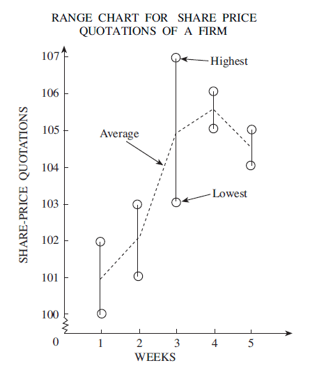
- For each time period, plot the maximum and minimum values of the variable and join them with straight lines to get the range lines.
- Plot the mid-point (average value of the variable) for each period.
- Join these points with straight lines to get the range graph. The range graph thus depicts the maximum, the minimum, and the average value of the phenomenon for each period.
Method 2:
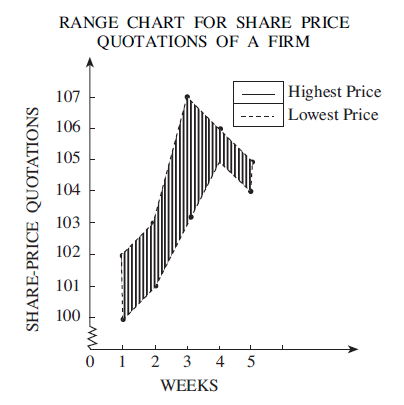
- This method consists in plotting two line graphs, one corresponding to the maximum
values of the phenomenon for different periods and the other corresponding to the minimum values. - The space between the two line graphs depicts the range of the variation and is prominently displayed by proper filling or shading it.
Let us understand how to plot a range chart by looking at an example.
Example of a Range Chart:
Consider the following data showing the share price of a firm over the course of five weeks:
| Week | High | Low |
| 1 | 102 | 100 |
| 2 | 103 | 101 |
| 3 | 107 | 103 |
| 4 | 106 | 105 |
| 5 | 105 | 104 |
By plotting the highest, lowest and average values as explained in method 1, we obtain the range chart as follows,
As described in method 2, we can also obtain the range graph by drawing two line graphs and shading the area between them.
References:
Business Statistics – S.C. Gupta and Indra Gupta.