A frequency distribution simply tells us how frequently a particular value of the variable (class) is occurring. However, it does not tell us the total number of observations having value ‘less than’ or ‘more than’ a particular value of the variable. This information can be obtained very conveniently from the ‘cumulative frequency distribution’. When we plot the values of the cumulative frequencies on the Y axis, the curve so obtained is called a cumulative frequency ogive.
What is More than Cumulative Frequency?
The more than cumulative frequency of a value is the number of observations that are greater than or equal to that value. The more than cumulative frequency can be found by adding up all the frequencies of the current and succeeding the given class intervals. Let us try to understand this by looking at an example. Consider the following frequency distribution showing the marks obtained by students in a test.
| Marks Obtained (Class Interval) | Number of Students (Frequency) |
| 0-10 | 3 |
| 10-20 | 7 |
| 20-30 | 4 |
| 30-40 | 6 |
| 40-50 | 5 |
| TOTAL = 25 students |
Then the more than cumulative frequencies are as follows,
| Marks Obtained (Class Interval) | Number of Students (Frequency) | More than cumulative frequency |
| 0-10 | 3 | 3+7+4+6+5 = 25 |
| 10-20 | 7 | 7+4+6+5 = 22 |
| 20-30 | 4 | 4+6+5 = 15 |
| 30-40 | 6 | 6+5 = 11 |
| 40-50 | 5 | 5 |
| TOTAL = 25 students |
For example, the more than cumulative frequency corresponding to the class interval 20-30 is 15. This means 15 students in the class have obtained more than 20 marks.
More than Cumulative Frequency Ogive:
When we plot the values of the variable on the X-axis and the more than cumulative frequency values on the Y-axis, then the resulting curve so obtained is called a more than cumulative frequency ogive.
How to draw more than cumulative frequency ogive?
- Arrange the given data in the form of a frequency distribution table.
- Calculate the more than cumulative frequencies for each class interval by adding the frequencies of the current and succeeding classes.
- Plot the lower limit of the class intervals on the X-axis.
- Plot the more than cumulative frequency values on the Y-axis.
- Join the points to obtain the more than cumulative frequency curve.
Example:
Consider the following frequency distribution,
| Class Intervals | Frequency |
| 0-5 | 2 |
| 5-10 | 5 |
| 10-15 | 12 |
| 15-20 | 4 |
| 20-25 | 8 |
| TOTAL = 31 |
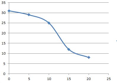
We first calculate the more than cumulative frequencies,
| Class Intervals | Frequency | More than Cumulative Frequency |
| 0-5 | 2 | 2+5+12+4+8=31 |
| 5-10 | 5 | 5+12+4+8=29 |
| 10-15 | 12 | 12+4+8=24 |
| 15-20 | 4 | 4+8=12 |
| 20-25 | 8 | 8 |
| TOTAL = 31 |
We obtain the following curve on plotting the values,