When the data is plotted in the form of a histogram it exhibits a degree of peakedness or flatness. The degree of peakedness or flatness of the data can be measured by calculating the kurtosis.
Kurtosis – Definition and Formula:
If the graph has a sharp peak at the center then it is said to be leptokurtic – it has positive kurtosis. If the graph is relatively flat at the center then we say that the graph is platykurtic, that is, it has negative kurtosis. The first graph in the diagram below is leptokurtic whereas the second is platykurtic.

The kurtosis (excess kurtosis) can be calculated using the formula, \text{Kurtosis }=\frac{\sum (x_i - \bar{x})^4}{nS^4} - 3
where, \bar{x} denotes the mean, S the standard deviation and n denotes the number of data values.
The kurtosis of the standard normal distribution is exactly equal to 3, so the above formula measures the excess kurtosis of the distribution. It can either be positive or negative. Since excel automatically computes the kurtosis for the given data, we have no need to apply the above formula.
Kurtosis in Excel:
Step 1: Open a new worksheet. Input the raw data values into the cells. For example, we input the data in columns B, C, D, and E in the example below.

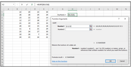
Step 2: Go to the statistical functions menu. Choose the KURT function in order to open the KURT function argument dialog box.
Step 3: Choose the cells where you have inputted the data values. Also, select a cell where you can obtain the output.
Step 4: Click on OK in order to obtain the value of the excess kurtosis as output on the selected cell.