Bar graphs are the most widely used category of diagrams used to pictorially represent categorical data. It consists of vertical bars with each bar representing a particular category and the height of the bar gives us the frequency of that particular category. In this article, we explain some of the advantages and disadvantages of bar graphs.
Advantages of Bar Graphs:
1. Summarizes large data in visual form
Suppose that we are given the data for showing the support for four political parties in a country. In this case, each person is an individual data point. Clearly, it is impossible to understand this data in raw form. A simple percentage bar graph with four bars can provide us with a quick summary of the data.
2. Clarifies Trends better than tables
Consider the same example as discussed above. Clearly, if one of the bars is very high compared to the other three bars we can conclude that support for that political party is highest among the given population.
3. Easily understood by most people
Bar Graphs are the most common method used to represent data in visual form. Therefore most people are familiar with bar diagrams and can easily interpret the data represented in a bar diagram.
4. Allows estimation of key values at a glance
By looking at the height of the bar we can get an estimate of the frequency for any given category. If the data is drawn to scale on a graph paper then we can even obtain the exact value of the frequency from the bar diagram.
5. Permits visual check of accuracy and reasonableness of calculations
Suppose that the height of one of the bars exceeds the given total frequency of the data. This is clearly impossible and therefore we can conclude that there must be some error during data transcription. Thus we can visually check whether there are any obvious inconsistencies in the data.
6. Displays relative numbers or proportions of multiple categories
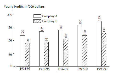
Suppose we are given the data regarding the performance of two companies over a period of 5 years. Here we are dealing with two categories so this data can be represented by a multiple bar graph. A multiple bar graph consists of two or more bars for each category to represent the additional data.
Disadvantages of Bar Graphs:
1. Requires additional written or verbal explanation
Sometimes the data in a bar graph can be too difficult to interpret on its own. In this case, an inexperienced person should be provided a verbal explanation to make sure that he draws the correct conclusions from the diagram.
2. Be easily manipulated to provide a false impression
By cleverly choosing the scale of the bar graph some scammers can make sure that one of the bars seems higher relative to the other. Even though this might not technically be a lie, it might suggest wrong conclusions to laypeople who are not trained statisticians.
3. Fails to reveal assumptions, causes, and effects
The bar graph does not give us any idea about the causes behind the given data. It also does not tell us under what assumptions the data has been collected.
4. Not Suitable if there are large number of categories
If there are too many categories to represent then we will need to draw too many bars to represent the data. This can make the diagram very cluttered and unreadable.
References:
- Business Statistics – SC Gupta
- Basics In Nursing Research and Biostatistics – Sreevani Rentala