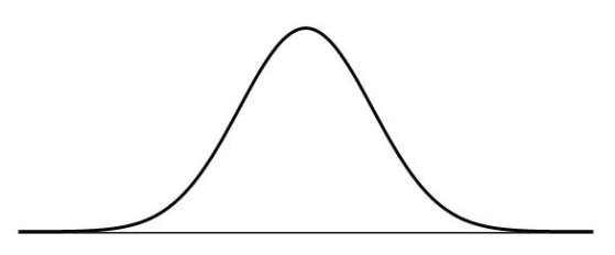
A symmetric histogram is a histogram for which the mean and the median are equal. If we draw a line through the center of a symmetric histogram it will get divided into two equal halves. The two halves will be identical mirror images of each other. A symmetric histogram is said to have zero skewness (no skewness).
Unimodal Symmetric Histogram:
If the symmetric histogram has a single “peak” then the distribution is said to be a unimodal symmetric histogram. The word “uni” means one which refers to the fact that the histogram has a unique modal value.
Example:
Consider the following set of data values given in the table below:
| Class Mark | Frequency |
| 0 – 10 | 3 |
| 10 – 20 | 5 |
| 20 – 30 | 7 |
| 30 – 40 | 9 |
| 40 – 50 | 7 |
| 50 – 60 | 5 |
| 60 – 70 | 3 |
On graphing the above table values we get a histogram as shown below:
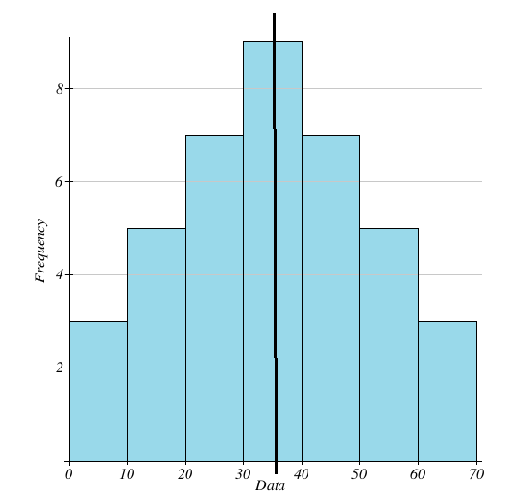
The graph is clearly symmetric about the line drawn through the middle. The peak is attained at the median which is equal to 35. We can calculate and check that the mean value is also equal to 35.
Bimodal Symmetric Histogram:
If the histogram has two “peaks” then we say that it is a bimodal symmetric histogram. The prefix “bi” means two indicating there are two modal values. Note that the heights of the two peaks in a symmetric histogram must be equal in order for the graph to be symmetric.
Example:
Consider the following set of data values given in the table below:
| Class Mark | Frequency |
| 0 – 10 | 2 |
| 10 – 20 | 4 |
| 20 – 30 | 6 |
| 30 – 40 | 4 |
| 40 – 50 | 2 |
| 50 – 60 | 4 |
| 60 – 70 | 6 |
| 70 – 80 | 4 |
| 80 – 90 | 2 |
On graphing the above table values we get a histogram as shown below:
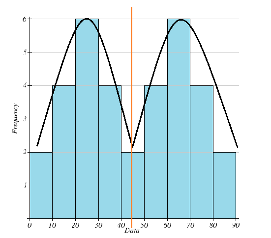
Notice that there are two peaks at the values 25 and 65. These are the two modal values. The median and the mean are both equal to 45. Note that the red line divides the histogram into two equal parts showing that the graph is indeed symmetric.
Real Life Example of a Symmetric Histogram:
If we were to plot the heights of all the adult males living in a particular city then the graph would be roughly symmetrical. This is because the vast majority of people would have an average height which would give us a “peak” in the center of the histogram. The number of short and tall people would be distributed roughly equally to the left and right of our peak giving us a “bell” shaped curve.